Introduction
There are a lot of tricks for turning otherwise simple geometry into something that looks much more detailed and complex. One way is to suggest that a surface is shiny, or has a smoother edge than is actually built into the wire mesh. This involves only a slight bit of texture work, and a little more planning when it comes to mapping the texture onto your 3D surface.
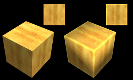
In the above example I have textured the very same cube with two slightly different textures. The cube on the left is mapped with a flat tiling, aged brass texture. This is great for expansive surfaces, but if we want to suggest this cube is actually made of metal we need to create the illusion that light is bouncing off the objects surface and edges. The texture applied to the cube on the right has only one difference. I have chosen to use the Photoshop Layer Style Inner Glow, set to Vivid, along all four edges of the texture. When applied to the cube these brighter edges suggest a highlight that isn’t present in the first cube. To add to the effect, I have also made sure to apply a Smoothing Group to the mesh which softens the transition further.
Adding Diversity
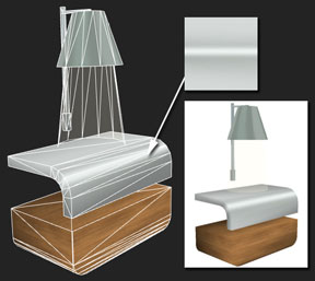
This notion of artfully placing a highlight works really well to suggest diversity in the surface material. In this example I have a very basic “gray” stainless steel texture with a blurred white “highlight” surrounded by a slightly darker gray to simulate a metal sheen. With just this highlight placed at the curving edge of the counter top, I achieve a much more sophisticated effect with very little complexity in the texture or 3D mesh.
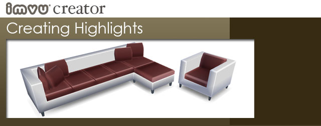
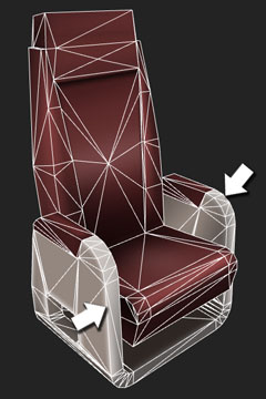
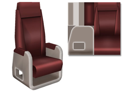
In this example I have been able to suggest a smooth turning edge with a highlight on the seat base, although the actual geometry is hard edged. Adding a Smoothing Group also does wonders for suggesting a smooth surface, and the rest is archived by suggesting highlights within the texture, as seen on the seat, back, and padded arm rests in the image below.
In this last example, the shiny counter surface is achieved using a simple tiled gray texture with a gradient of lighter and darker grays. For the wrap-around base of the bar I took an interior image, de-saturated, lightened, then distorted the image to suggest a room is being reflected in its curving surface. 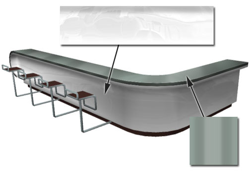 Like on a theater set, we are trying to give the illusion that more is happening on stage than is really there. Artfully placed highlights can do wonders for suggesting more complexity and detail in your products, without having to build poly hungry meshes or large textures to achieve the same results.