Introduction
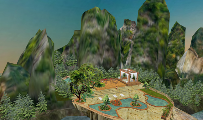
In the above example you see a 3D environment that has been given a lot of love and attention from its developer. The patio pools and trees are clearly in focus and have a lot of texture details. The surrounding hills on the other hand have a smaller texture applied to the entire surface.
This makes for a visual disconnect, where the landscape appears unrealistically out of focus and fuzzy. This is caused by the drastic difference between the size of the textures applied to the patio and those applied to the landscape.
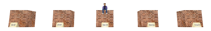
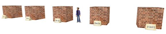 In this example I have textured 5 identical cubes, each with a different sized version of the same brick texture. This will help visually compare the qualities of each texture size. In IMVU we consider the avatar to be roughly 128 pixels tall.
 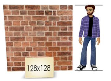 We consider this scale to be the best visual bridge between the size and detail of the avatar and the size and detail of the surrounding environment. This texture size also helps your scenes run smoothly on most of your customer’s computers.
More details looks good, but can cause your environments to slow down the experience for those IMVU members that do not have faster computers.
Power of Two Rule
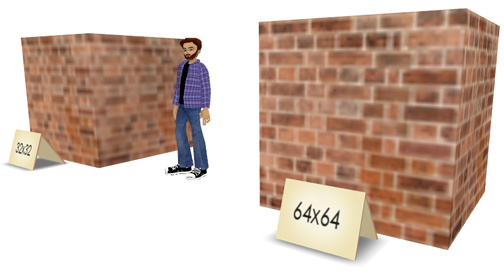
All of your textures should follow the Power of 2 Rule, this will ensure that they appear and run at the highest efficiency. At the lower end of the scale at 32×32 and 64×64 pixels, like the mountains in the example above, the textures become blurry and out of focus.
There is just not enough detail to clearly see the texture, and it makes it look like you might need new glasses. 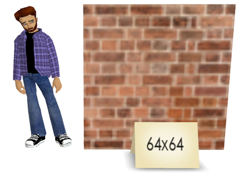 As you can see the 64×64 texture, which is four times smaller then the 128×128 example is noticeably blurry and will be made worse when placed near an avatar. At a fourth of the size, 64×64 would do a better job of texturing a pair of shorts or a hat and not the entire avatar.
 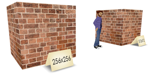 On the higher end of the texture scale, 256×256 and 512×512, despite the fact that the 512 texture has four times the detail of the 256 texture, there is little to no difference in the final appearance.
 With that said, there ARE some situations where using a smaller, less detailed texture is advantageous. Smaller, lower resolution textures look bad whenever an avatar is close enough to allow a visual comparison.
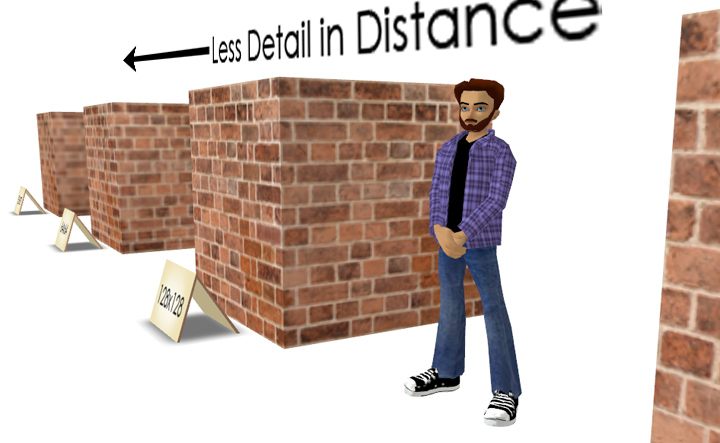
In come cases smaller textures can be applied to surfaces that the avatar will never be near to suggest distance. In the above example, the blurriness of the far texture suggests that the “camera” focus is on the avatar and not on the distant cube. This can help focus attention on the elements nearest the avatar and away from the surrounding room.
The mountains in the top example take this to an extreme that ultimately does not work, but in some cases lower resolution applied to things like distant trees and landscape can focus interest and add drama to your environments.