 Like any medium, there are limitations that an artist needs to work within to turn their ideas into reality. Creating objects, clothing, and environments in low poly 3D is no different. Depending on the capabilities of the engine you are building for, you may find yourself having to think of some very creative workarounds to reach the final effect you are after.
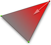
Currently IMVU does not support “spot lighting”, this is the ability to shine a light on an object, which highlights some areas (nearest the light source) and allows other areas to fall back into shadow. To achieve this effect without the light source we need to come up with a way to “paint” these highlights and shadows on the surface of our models.
Shadows
In the world of theater, where the light isn’t, is frequently more important than where the light is. Shadows act as the framework around those areas the designer wishes his/her audience to focus. Shadows also help define the surface of a material, and can even enhance the sense of the solidity of an object.
Best of all, shadows can trick the eye into believing there is more detail in an object or environments then there actually is. This is especially handy when all you have to work with are a few polys and a handful of textures. The world of the computer is a mathematically perfect one. A place without the organic asymmetry that we are accustom to in the natural world. This is why 3D environments can sometimes feel sterile and cold.
With everything at right angles, and every texture applied like wallpaper, it can be an uphill battle to create places and objects that feel “real” or natural.
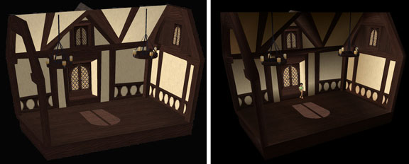
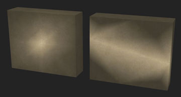
In this example, you can see what this interior model looks like with just the textures applied to it, but no further detail. The image on the right is the same room with Vertex Paint applied to it. Although there is no true light source, the shading applied to the surface using the vertex paint suggests that light is coming through the window, casting shadows on the far wall and illuminating the sidewalls.
Vertex Painting in 3D Studio Max Many 3D software applications include some method for shading, tinting, or painting the polygons beyond just the textures applied to their surfaces.
3D Studio Max includes the ability to Vertex Paint geometry, but it is a little misleading to call this “painting” since your control of how the final painted object will appear depends a lot on the way the 3D engine interprets the vertex paint information applied to it. This being so, I prefer to think of this as more “vertex tinting” since your actual color results may vary from model to
I also consider this a “wide brush” approach, rather then a fine precise tool, since how the tinting appears on your model depends on how the geometry is constructed beneath it.
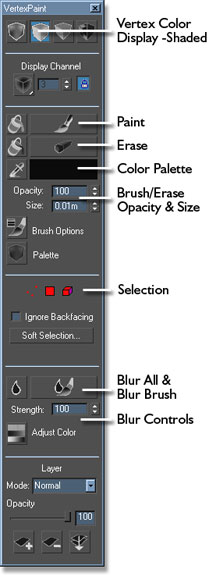
Painting
When you are painting (or tinting) the surface of your model, you are not actually applying color to the surface of your polygons; you are applying information to the vertex points and suggesting how the color will project from that point onto the surrounding polys. The effect can be very convincing if done correctly, but if applied incorrectly, can expose the unflattering limits of your geometry.
In some cases, adding a little more geometry in strategic places will give you a much better effect then leaving it out, and can actually allow you to use less texture detail since the vertex tinting will be doing a lot more of the aesthetic work for you.
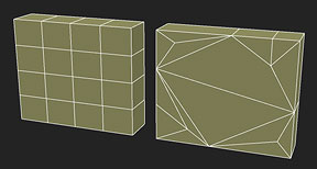
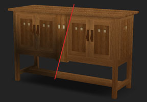
A good rule of thumb is that a “grid” construction in your mesh is better for vertex lighting then stretching your polys to the extreme. The grid allows you more control over how the vertex tinting will appear on the surface, while the stretched polys will give you less desirable results.
Vertex Paint Tips & Tricks
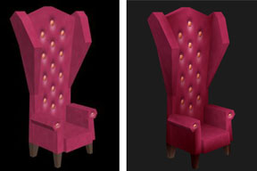
Painting in Shadows If your model lacks depth, the easiest method is to just paint them in! Create a color that is darker then your model and suggest lighting applying it to those areas you wish to suggest are furthest from that light source.

Erasing in Highlights
One of my favorite tricks is to use the Paint Bucket tool to completely cover a model with a darker “shadow” color, then use the Eraser tool to remove the paint from just those areas I would like to suggest highlights. This is very effective if you wish suggest drama and mood.
Blurring to Blend Color
Because you are limited to the paint results only looking as good as the geometry it is applied to, you are going to inevitably have the edges of some polys appear on the surface of your model. To minimize this you can use the Blur tool to soften the edges. I also like to apply the Blur to the entire model, then come back with the eraser to pull out the highlight once again before I am finished.

Painting Generic Textures to Create Variety Inexpensively
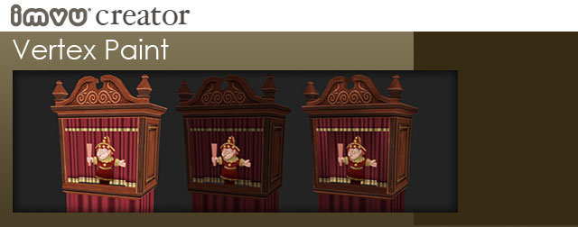
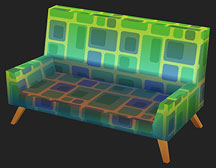
Another handy trick is to create a base texture without color, then paint that color in later with vertex paint. For these party lanterns, I created a simple black and white texture then applied it to each mesh and colored them separately within the model.
Colored Shadows
Many 3D computer games use vertex painting heavily to suggest mood and age in their environments. As suggested earlier, they will choose a shadow color and paint that lighting and aging in manually rather then depend on their 3D renderer to do all the work. One of the potential pitfalls comes when these game lean too heavily on gray as their primary shadow color.
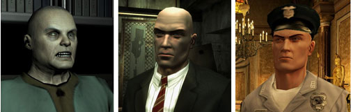
In the real world light sources come in different colors, and any first year art student knows that this means that the shadows cast by that light will appear as the complimentary color of that source. Although subtle, yellow sunlight casts a purple shadow, orange a blue shadow, red will cast green, etc. Where this is most noticeable is in flesh colors.
Although next generation games have stunning graphic capabilities, if the environmental ambient colors, or vertex painted colors, applied to their characters is gray their virtual human actors can look dead, or bruised. Without closer attention paid to how shadow colors affect the surface of objects you can end up with models that are dramatic, but unrealistic.
Too Much of a Good Thing
I can fall into the trap of leaning too heavily on vertex paint on my own creations, so be careful. Adding drama is nice but it isn’t appropriate for all situations. When in doubt, err to going lighter with your vertex paint then heavier.
 Most importantly, have fun and play around with what vertex paint can do for your scenes and objects. Think of it as just another tool in your arsenal of tricks to make your creations look great.