Introduction
We have spent several months creating tutorials for all the various steps used to create a product for the IMVU Catalog. Over time we realized that although we covered many of the mechanical steps used in the creation process, we haven’t yet talked about our artistic motivations, or many of the tricks we use along the way. We decided to create a series of tutorials that follow us through the process of creating several products, and we wanted to pay close attention to why we are making the choices we do along the way.
![]()
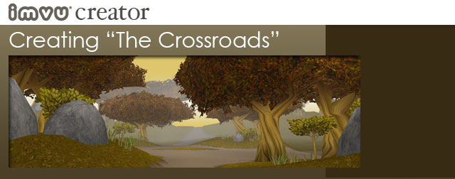
Creating a Room: “The Crossroads”
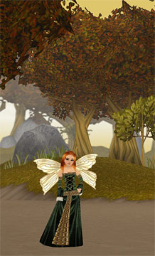
One of our many personal projects is to create a series of products that are thematically linked together. These would be a collection of “Rooms” that build upon each other and encouraged other developers to come “play” with us as we continued to add to that initial theme. For this particular project we are creating a Renaissance Faire venue for the placement of craft booths, guildhalls, games, and all the supporting props and costumes that might appear in a Faire setting. To do this we needed to create a consistent visual style and a way of working that would support our ultimate goal of building a series of places that felt like they belong together.
Part of creating an integrated style meant that we had to work within the limits of what is achievable inside IMVU, but still push at the boundaries of what is artistically possible. Although we have been creating 3D products for several years now, we are always trying to stretch what we are capable of achieving, and expanding on the definition of what a virtual chat environment can be.
![]()
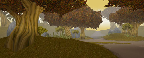
Geometry
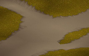
To being with, I wanted to create an outdoor setting that would give the illusion of being connected to a larger world than could easily exist within the polygon limits of what we consider a 3D Room product. To do this I had to build an environment that focused a lot of detail and complexity at its center and less at its distant edges. Rooms can be anything, but they still are limited by how much geometry can be included within them.
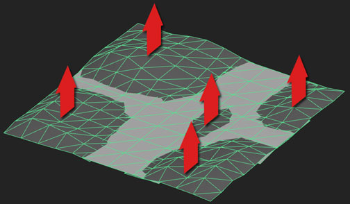
I wanted to create an outdoor forest scene, one that gave the illusion that you were in the center of a Crossroads, with paths leading off in four directions. Later I will suggest that these various paths are going to eventually meet with other places (Rooms), but for now I had the challenge of making a natural setting with as few polygons as possible. This can be hard because natural places tend to feel asymmetrical and organic, and that is tough when you are limited to only a few thousand triangles to build with.
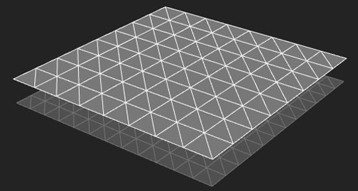
I started with two Planes, one on top consisting of an 8×8 square grid, and one below made of 12×12 squares. Because I will be using the top layer to place furniture on, I need it to be perfectly flat. Although I “could” use only a one square grid for my flat plane, I wanted to include some soft vertex lighting on the ground surface and only additional geometry will allow that to work properly.
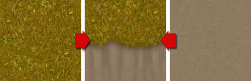
Terrain Textures
When creating the textures for the terrain, I wanted to create a more organic transition that draws attention away from the hard edge that is created when the two geometry planes meet. To do this I created three textures, a tiling grass texture, a tiling dirt texture, and a transition texture (made using the previous two textures). Note how relatively boring and flat the textures are… this is actually on purpose since textures with a lot of detail and contrast tend to create noticeable repeating patterns when tiled. I applied the tiled dirt texture to the flat plane, and the grass texture to the “hilly” plane, then individually applied the transition texture where the two planes meet. Although this takes a little more time to Map, the results are worth the effort. In this case I have suggested a slight mud embankment just below the grass in the transition texture. This does a better job of suggesting that the grass areas are elevated for a more naturalistic reason, rather than being merely two carpets meeting on an uneven surface. 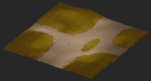
The last thing I do is apply vertex shading to the terrain square. I do this by flooding the entire surface with a darker tint then erase highlight. This will suggest light falling through the leaves of the trees I will soon be placing. You can see why I added the additional geometry to the flat plane. If I had not the vertex shading would have not blended properly as it transitions from the rolling grass hills to the flat dirt areas.
![]()
Creating Trees
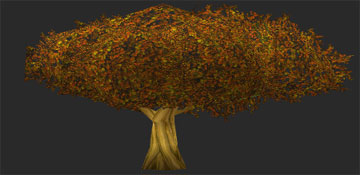
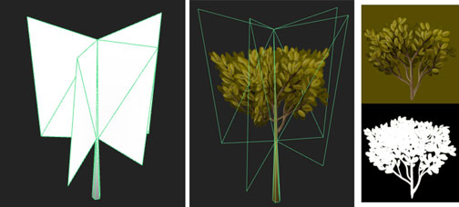
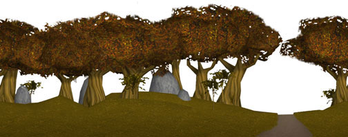
Now it is time to create the trees. Like the terrain, I want to make sure that I get a lot of mood and variety without too much geometry. To do this I create some fairly simple cylinders with branches extending in several directions at the top. A lot of my detail will exist in the texture I apply to it, but I also want to make sure that some of the organic quality comes from the geometry as well. It can be really challenging to map textures to organic surfaces, so I will often apply my textures before I attempt to torque or twist my geometry. In the case of the trees, I made sure to map my vertical texture to the more symmetrical tree model and only after I was happy with how the textures were applied did I start grabbing sections of the tree and start twisting them around. This does stretch the textures a bit, but it also gives me a more organic result.
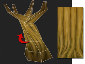
To create variety in my forest of trees I will squash and stretch each duplicated tree trunk to give the illusion of variety. It is actually amazing how much diversity you can create with relatively little effort. I will also pull on the verts at the base of each trunk to better help it conform to the uneven surface of the hilly terrain.
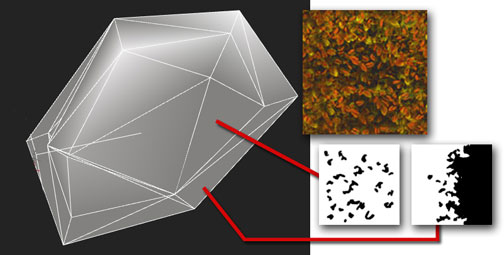
Leaves on trees can be tricky. You want the illusion of density, but you also want to avoid creating something that includes too much geometry. To create the leave on my trees I started with a modular mesh that I could use to construct a variety of tree foliage types. This model consists of a solid central core (or pillow) and has “wings” extending from several of the hard edges. 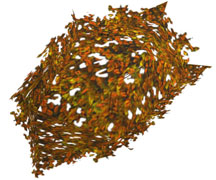
I have created a base leaf texture and two opacity maps (each will be saved as their own material and .xrf file). The body of the leaves use the first mostly opaque opacity map, the second represents the edges of the leave clump. The goal here is to create something organic enough that it doesn’t draw attention to the simple geometry that it is composed of. In the example on the left you can see what the finished clump of leaves looks like. Once the leaves are clustered over the trunk they will have a more realistic quality. This final tree model is built using seven of the above leaf clusters. Although not completely realistic, it certainly does the job, especially as a background element in our environment.
Artistic Note
![]() This is a good time to talk about the artistic choices I am making in the building of my scene. Although I might have been able to find photographic reference for many of my textures, I have purposely chosen to paint all of my textures myself. One way to insure that all of the various pieces that go into your scene are cohesive is to have full control of both the color palette and eventual appearance of the final textures. It is also important to point out that my textures have a hierarchy of their own. You may have noticed that both the grass and dirt textures are really quite neutral, while the leaves and tree textures are more complex, in both color and contrast. This is completely on purpose. By deciding what will draw attention and what will fall into the background, I have more control over the actual experience of those members visiting it!
This is a good time to talk about the artistic choices I am making in the building of my scene. Although I might have been able to find photographic reference for many of my textures, I have purposely chosen to paint all of my textures myself. One way to insure that all of the various pieces that go into your scene are cohesive is to have full control of both the color palette and eventual appearance of the final textures. It is also important to point out that my textures have a hierarchy of their own. You may have noticed that both the grass and dirt textures are really quite neutral, while the leaves and tree textures are more complex, in both color and contrast. This is completely on purpose. By deciding what will draw attention and what will fall into the background, I have more control over the actual experience of those members visiting it!
![]()
Static Rooms
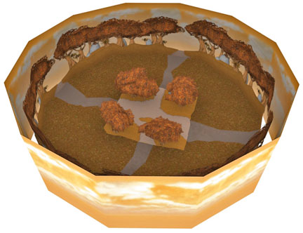
Unlike a free-roaming virtual world like World of Warcraft, IMVU is made up of static settings, or “Rooms” where avatars can meet and socialize. You can think of these Rooms like theater or movie sets. For us to create large environments we need to suggest complexity in the distance without actually building that detail out of geometry. In the case of our Crossroads scene, all of our detail and complexity is at the center of the room, and all outlying areas are made up of backdrops or flats. I call this the “Salad Bowl Approach” where all the good stuff is in the middle and the surroundings are there as a container for that theme or experience.
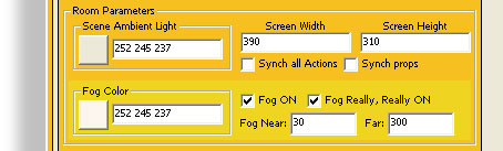
Surrounding the inner environment I wanted to imply that the forest trees continue, but I didn’t want to create it using reference that looks unlike the environments I have built for its center. To create the surrounding forest I rendered my central trees in various positions then created a 2D panorama in Photoshop. I generated an opacity map to allow you to view the sky backdrop, which comprises the outer wall of my scene. For the sky, I have purposely created a warm and subtle backdrop that slowly scrolls. This is to create atmosphere without drawing attention to itself. I then set the Ambient and Fog settings to the same color range to give the illusion that the light created by the sky is effecting the entire environment.

![]()
Nodes
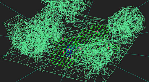
With all the models built and textured, now we can add the Furniture Nodes. Since the only flat area of my model is the paths, I am going to limit my node placements to those areas. I “could” place nodes on the hills for additional tree products, but since the surface is uneven pretty much everything else placed on them will look awful. In the spirit of making the Room as nice looking as possible I have decided not to do that.
Once everything comes together we can check to see if all of our ideas are working as we had planned. The colors should be complementary but not add so much variety that it becomes visually confusing. The detail of the tree trunks and leaves draw attention and the simple ground, grass, and sky textures visually support rather than complete. The fog and light settings are working well with the colors in the textures create a sense of depth and atmosphere. All the foreground elements contain just the right amount of detail and complexity with the background flats subtly suggesting this same complexity without having to create more geometry to achieve this look. All in all I think this works very nicely, and since this is ultimately just a backdrop for a lot of furniture items, it is a good start. Our next challenge is to create products that work well within this setting. We will also explore other ways to attain a similar effect but with different environmental colors and settings.